How did my design evolve while constructing the prototype?
During the construction of the prototype, as well as during testing, many issues were identified:
Originally, the hair piece selector was on the left side, turned out to be not convenient to use, far to reach with one hand, and covering some of very useful camera view area. It was decided that the hair piece selector needs to be on the botom
Then, with many hair pieces available, only 4 were displayed by default, and user needed to do horizontal scroll to uncover more. It was not intuitive that it is scrollable. It was resolved by arranging it in a way that 4th head piece thumbnail is displayed partly, giving a hint that it's scrollable.
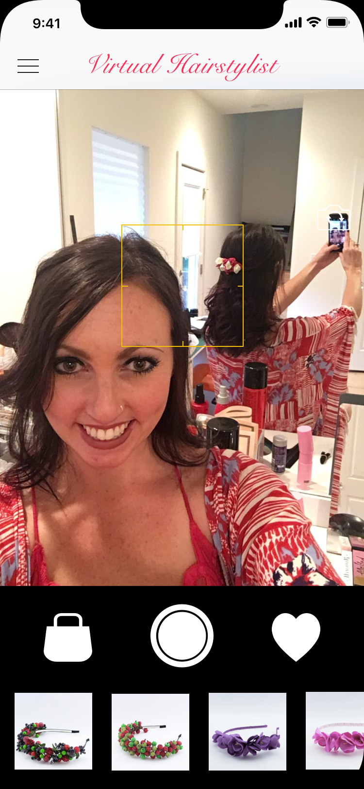
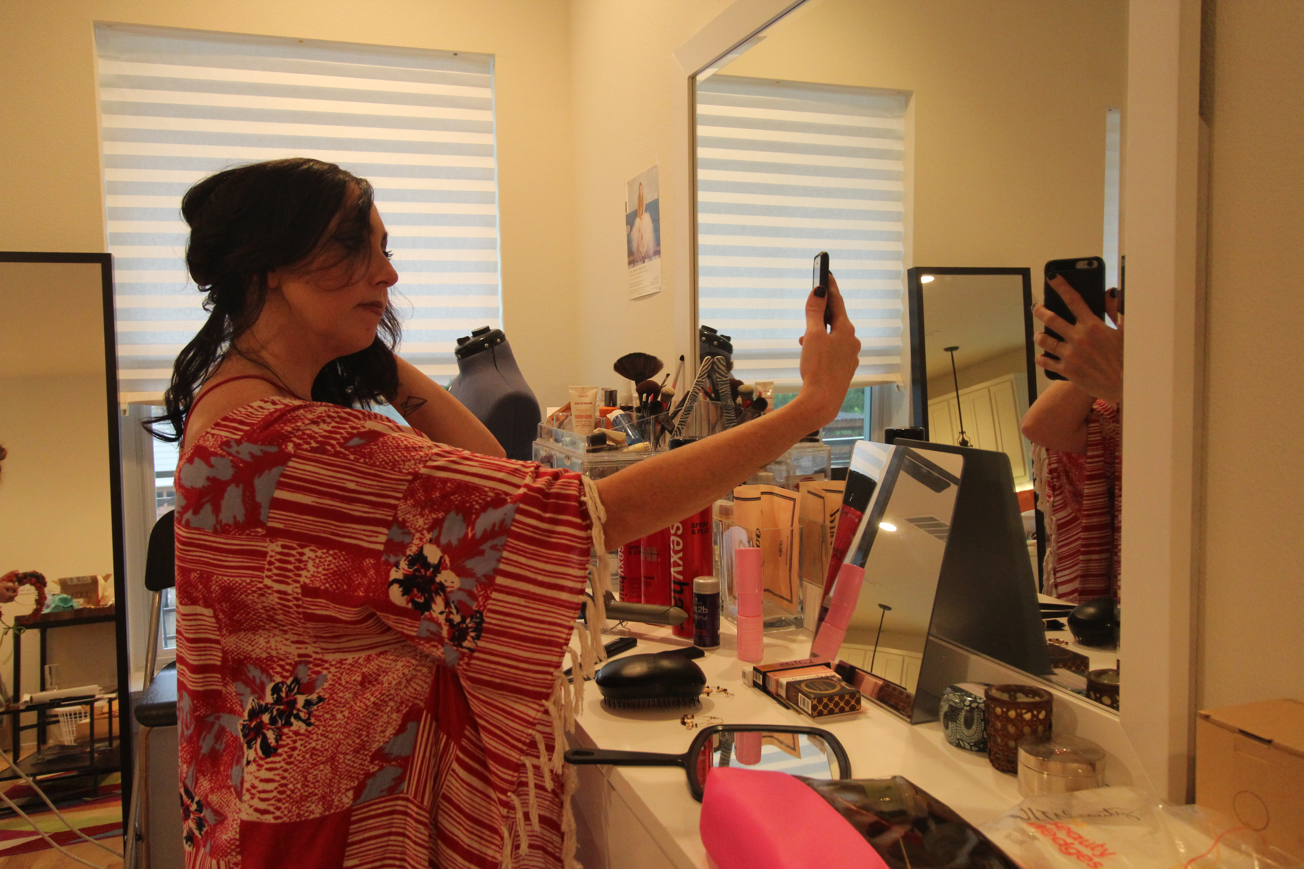
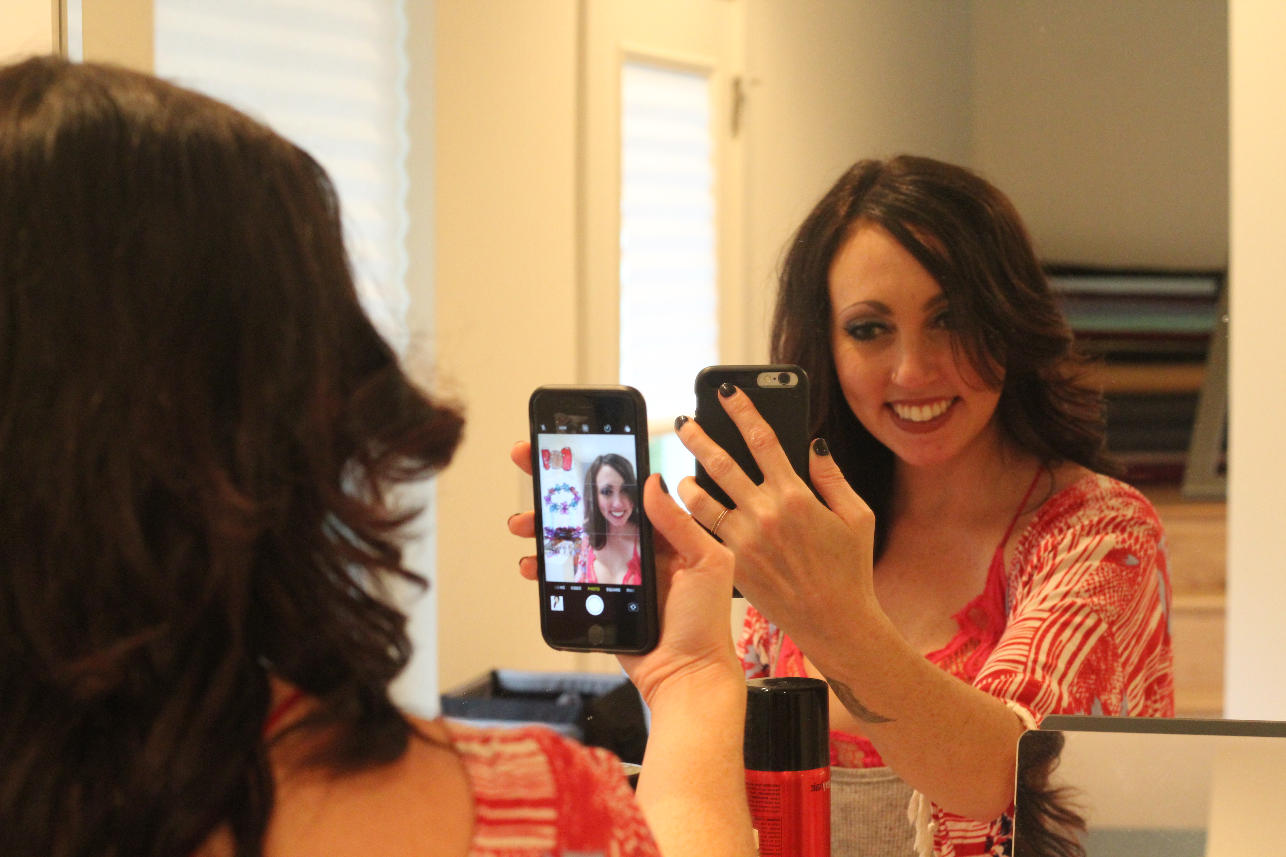
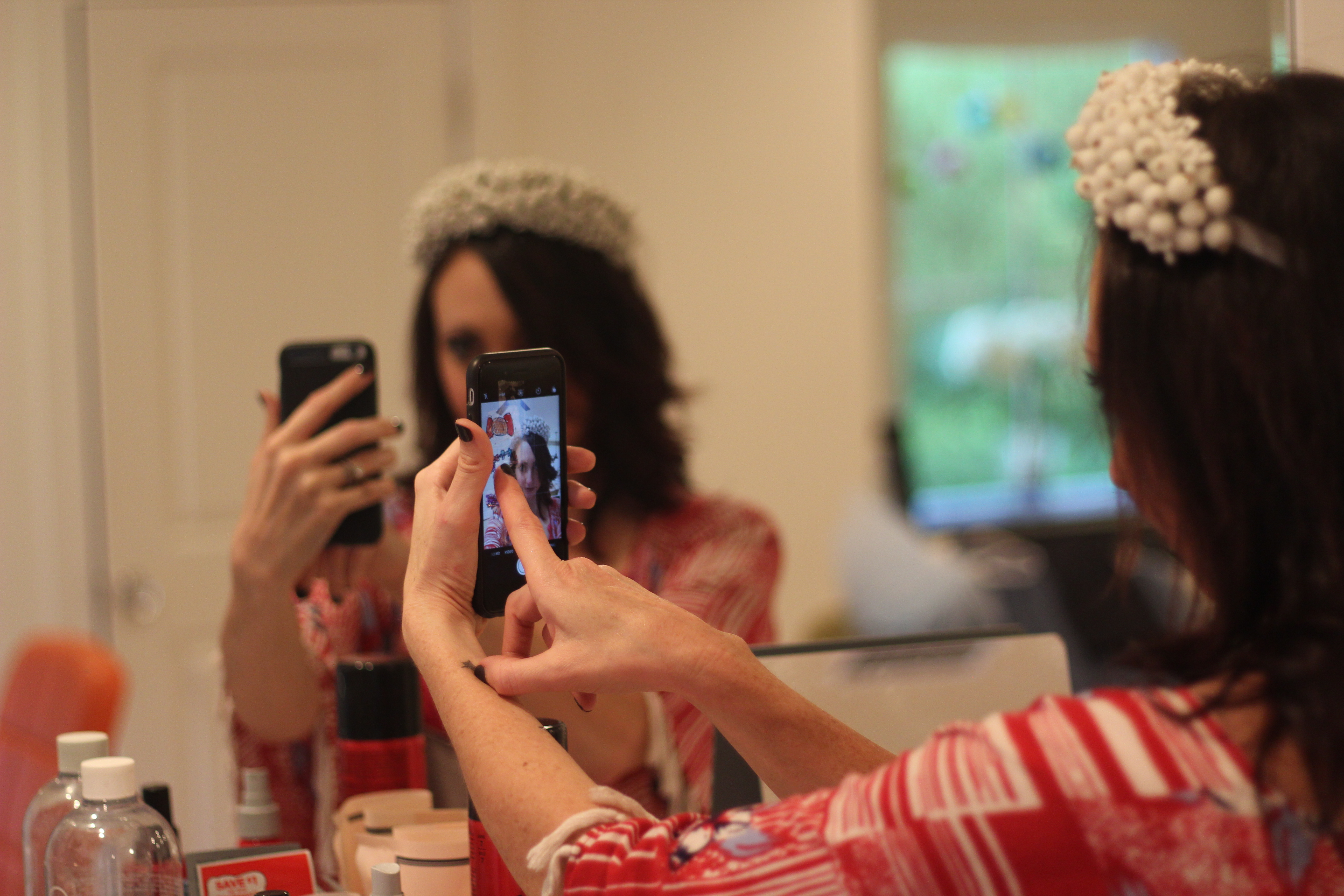
Hair pieces that are held on the rear of the head are almost impossible to display in the right way with just camera, they require a use of a mirror.
What feedback was unexpected from testers?
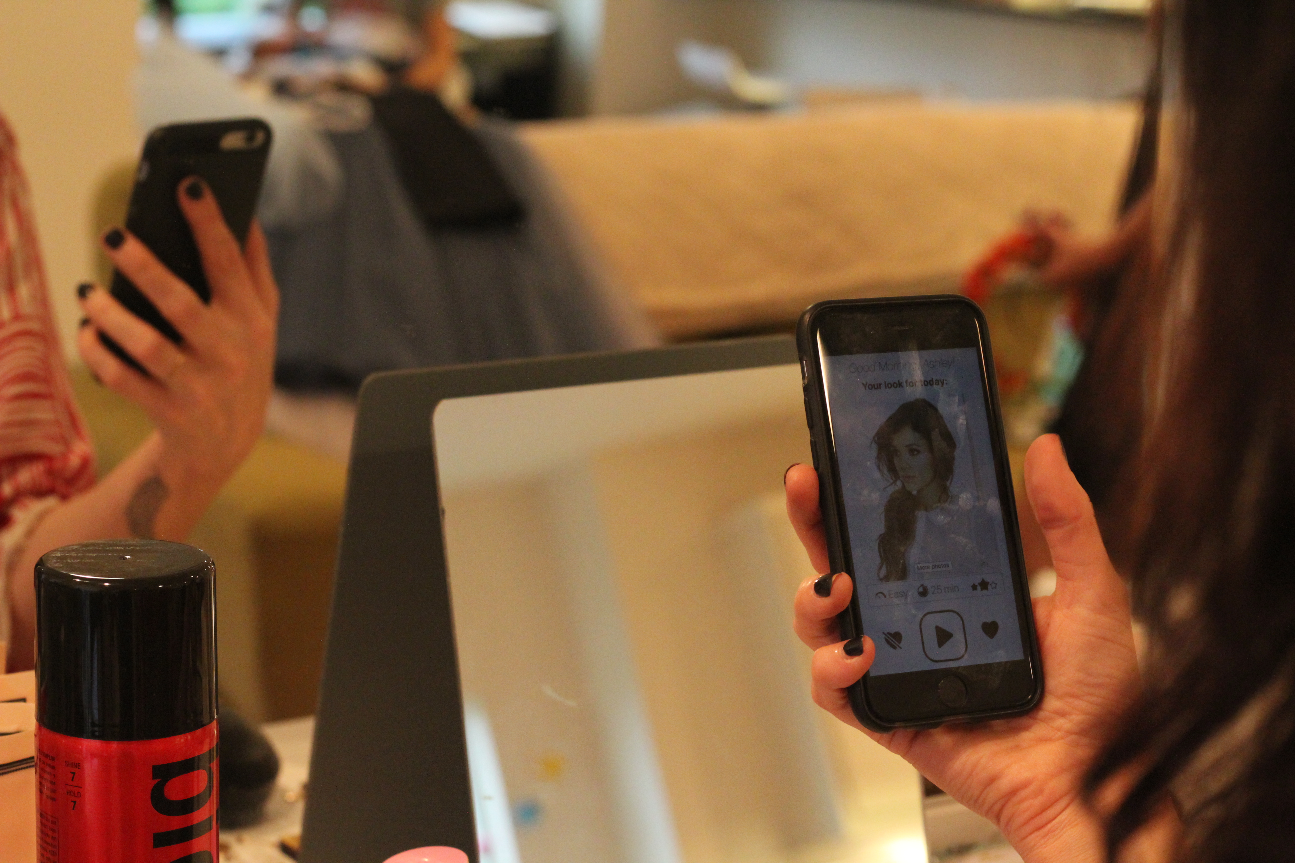
The tool was first perceived as a simple "face filter" toy, an entertainment tool like instagram. But it is an application that allows you to actually make an order and get the hair piece that matches the hair style ordered.
How would I improve your prototype for future testing?
Find a creative way to display rear-held hair pieces, especially with limitations of AR
Provide a more clear message around shipping/delivery
Provide a more clear message on what exactly "try head accessories" means, it is not obvious that it will be AR experience