
There I found myself waist-deep in tutorials for new software, scouring blogs and Apple’s website for some guidance. I didn’t have a clear vision for my product, so I figured I would start learning some new tools and hoped the inspiration would come to me in the process. From those resources, I gathered that I could feasibly drop a stationary virtual object in the room, but a moving object may be out of reach for a complete novice. That rendered one of my ideas, a dynamic fitness move demonstration, less attractive. So, with additional affirmation from my wonderful AC4D mentor and alum, Sally Hall, I pursued my vision of a virtual runway for the user to strut down.
After getting a slight grasp of Xcode, I soon realized that I would need to either find or render a 3-D object, another element of this endeavor I had never tackled. For the sake of efficiently getting something out there I could test, I found a free online model that suited my vision quite well.
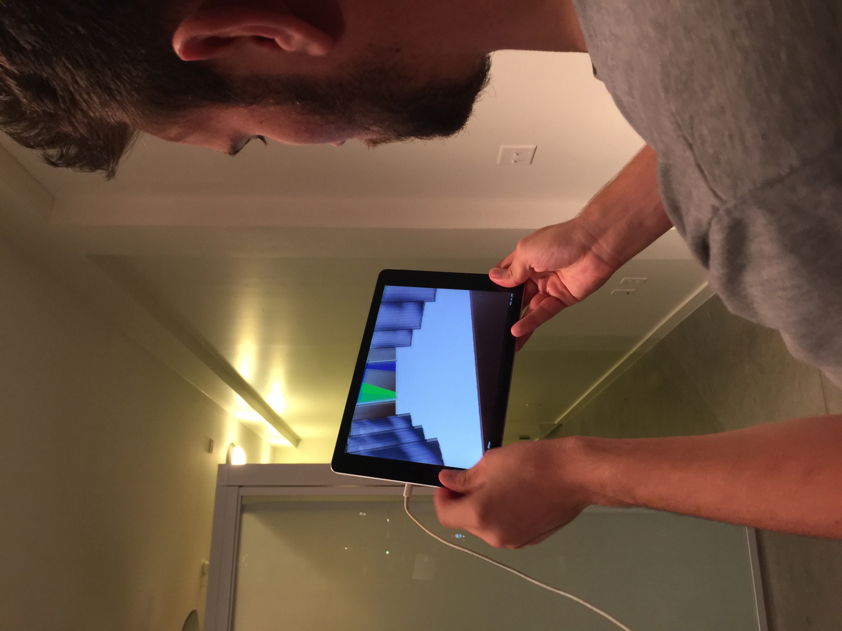
I played with the 3-D coordinates for a good chunk of time, getting a feel for what each does, and then eventually the runway appeared where it was intended. What an exciting moment!
My original idea included different moods or themes of runways, which is a feature I hope to add as I learn more about Xcode and leveraging GitHub resources. Ideally, I would also craft my own runway to render the feel I’m after.
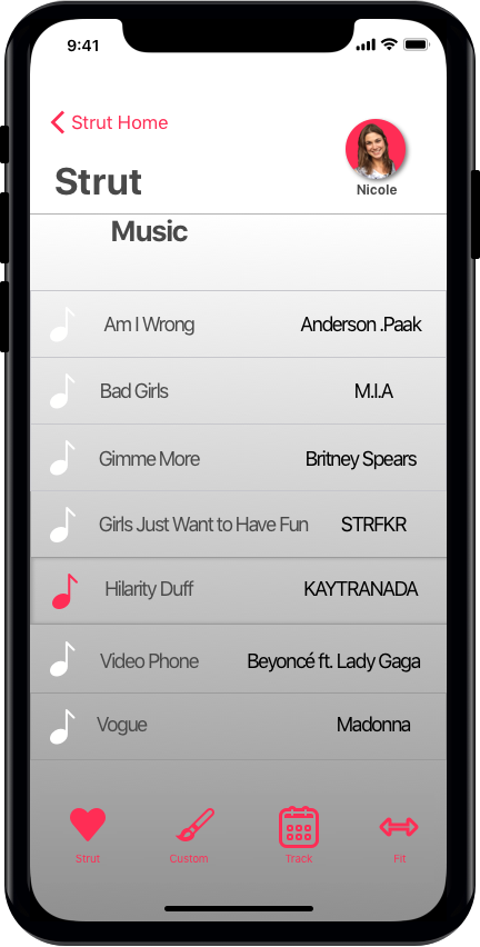
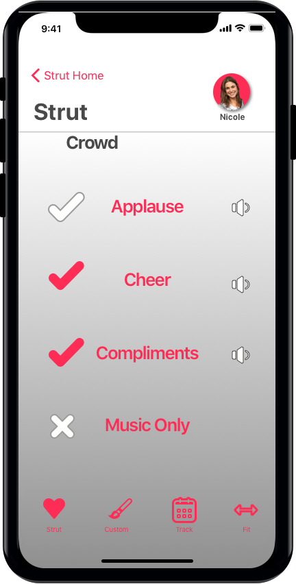
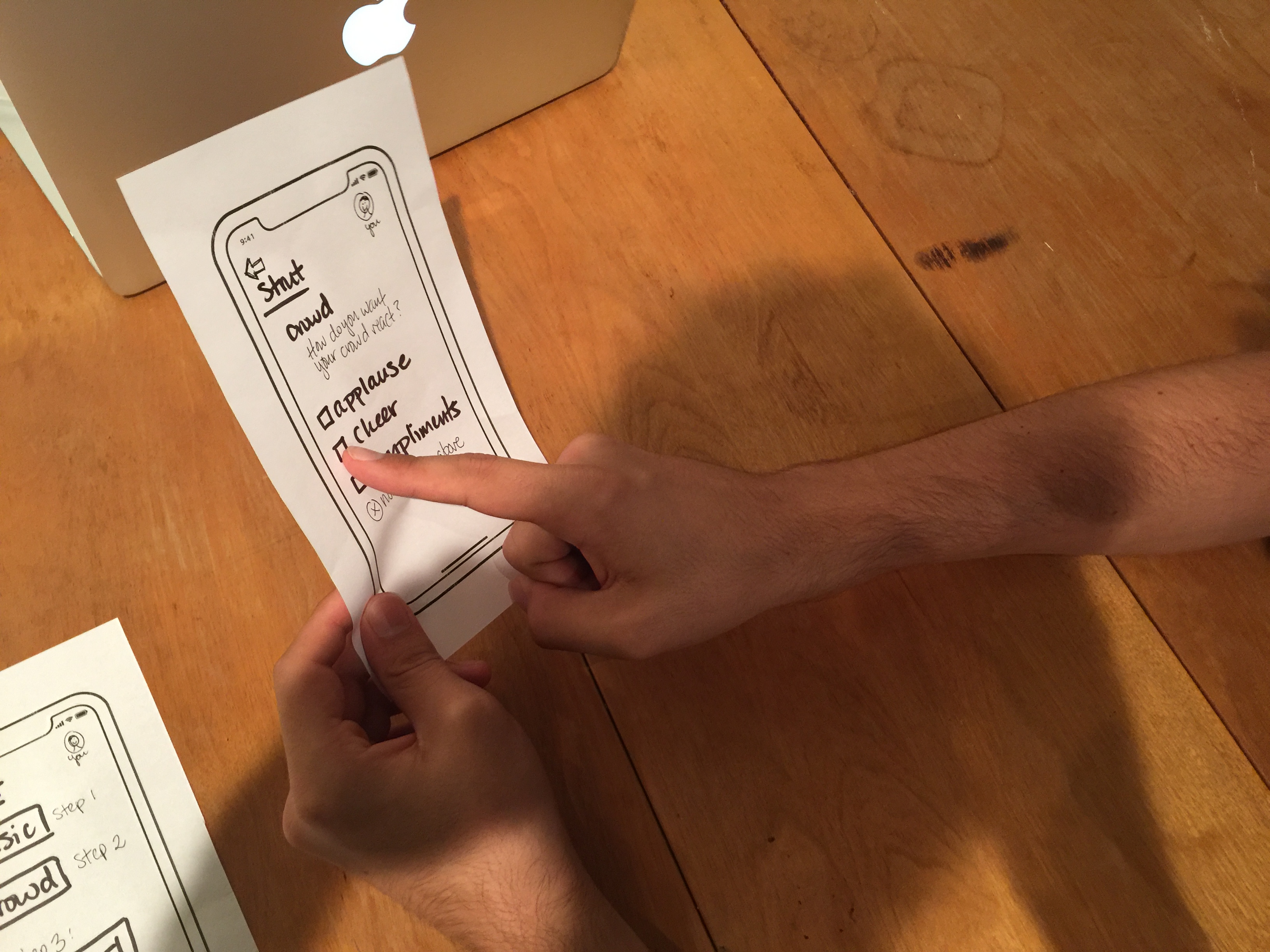
Music selection was another initial inspiration that I did carry through to testing, although it was through a Spotify playlist that I curated for the Strut application. To replace the runway moods, I came up with crowd reactions and feedback. Strut could be a playful “pump you up” feature before you go out, and that praise can feed right into it; select all that you want: applause, cheer, and compliments. This feature was also tested outside of the application itself, which prompts me even more to pursue a music and sound integration in a later version.
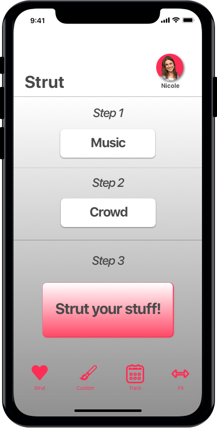
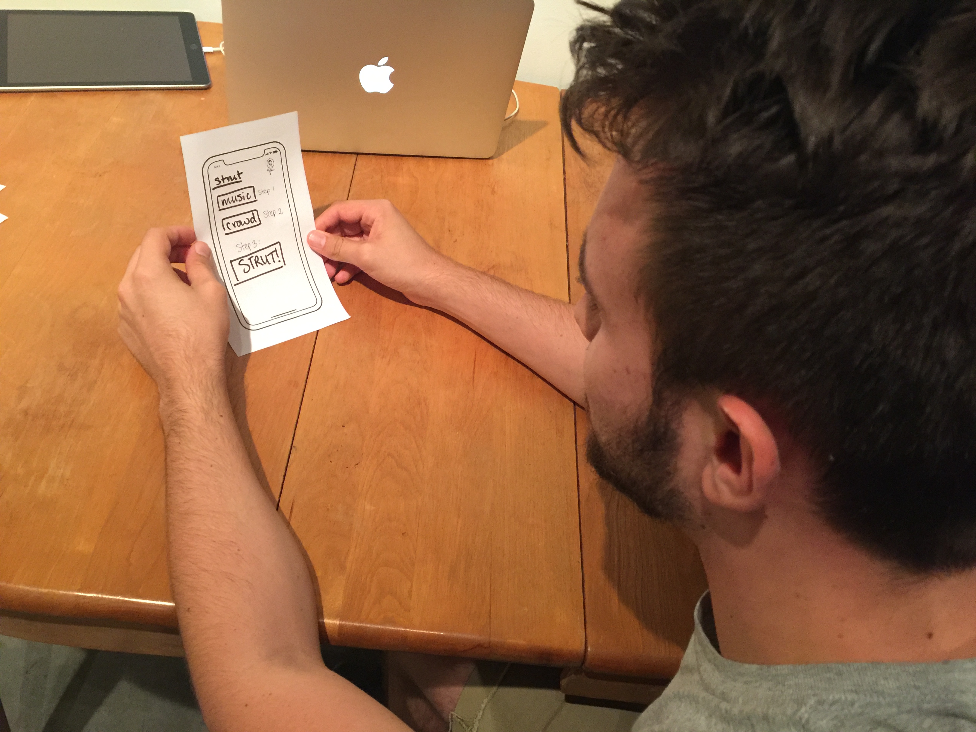
When I moved into testing, I quickly learned that my home screen hierarchy wasn’t nearly as obvious as I had thought – even numbering didn’t make it clear. Explicitly stating, “step X” was a useful piece of feedback that I implemented into the screen mockup. This also remediated my first user’s inclination to go from my prescribed first step straight to the third, passing over the crowd features. This highlighted the importance of giving my users a clear path.
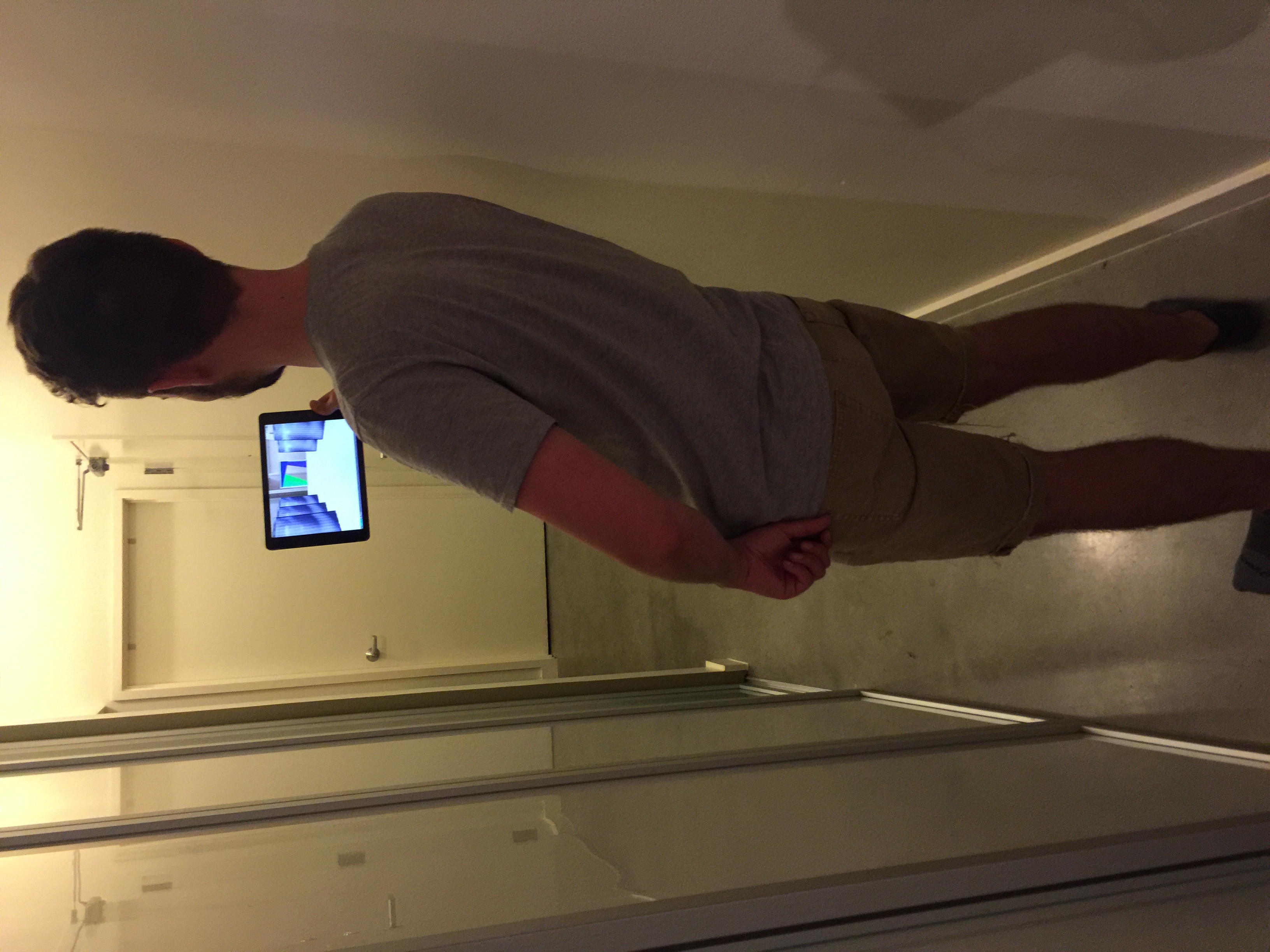
Once my users got to try the actual application, I learned that the runway element wasn’t as communicative as I had anticipated – the connection is a lot easier to see when you’re the one designing it! To help it read accurately for others, I want to add some people to the crowd on either side of the runway, which I, too, included in the corresponding mockup.
I was happy to see that my product was indeed fun and playful, which was my primary goal. My first user jammed out down the runway once she got a feel for it, and my second user entertained himself making silly poses at the end of the runway. To push this forward and keep it on-brand with my other projects, I want to refine the shapes and adjust the color scheme, as well as continue to integrate the functions laid out above and design my 3-D object to move with the user in any direction – every part of the home should be a catwalk.
For kicking off this project totally lost, I now find myself in an enthusiastic state. I see the potential to craft something cool and unique, and that’s really motivating. I might just runaway with it!