Links
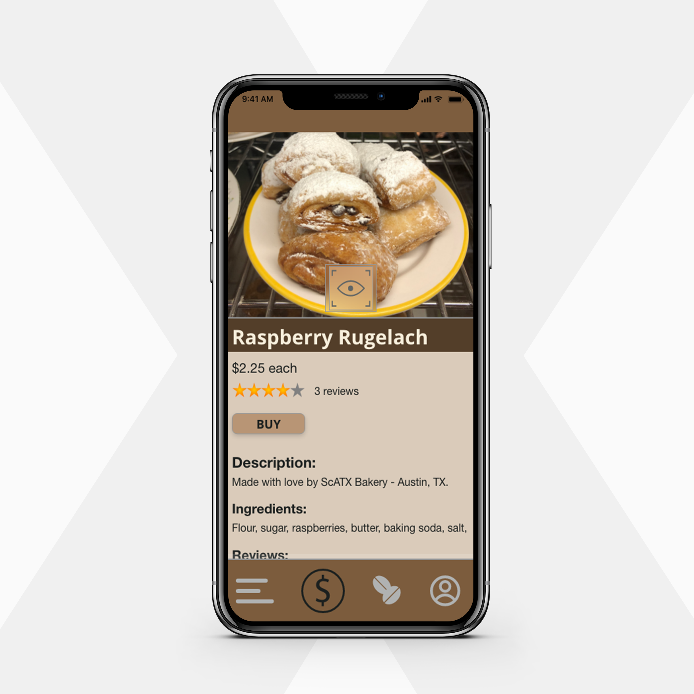
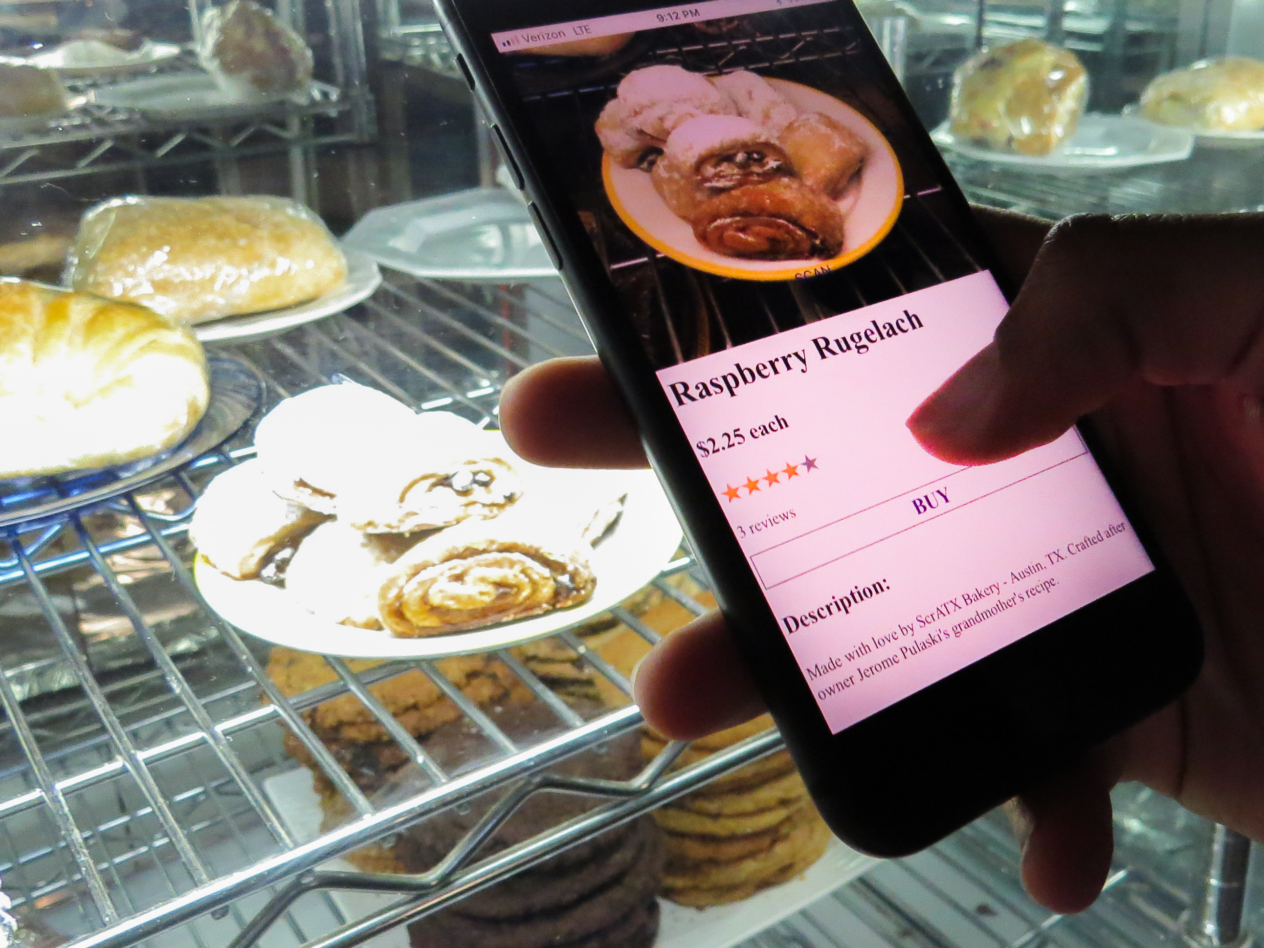
- Raspberry Rugelach Scan Page
- Raspberry Rugelach Purchase Page
- Chocolate Cookie Scan Page
- Chocolate Cookie Purchase Page
- Banana Chocolate Chip Muffin Scan Page
- Banana Chocolate Chip Muffin Purchase Page
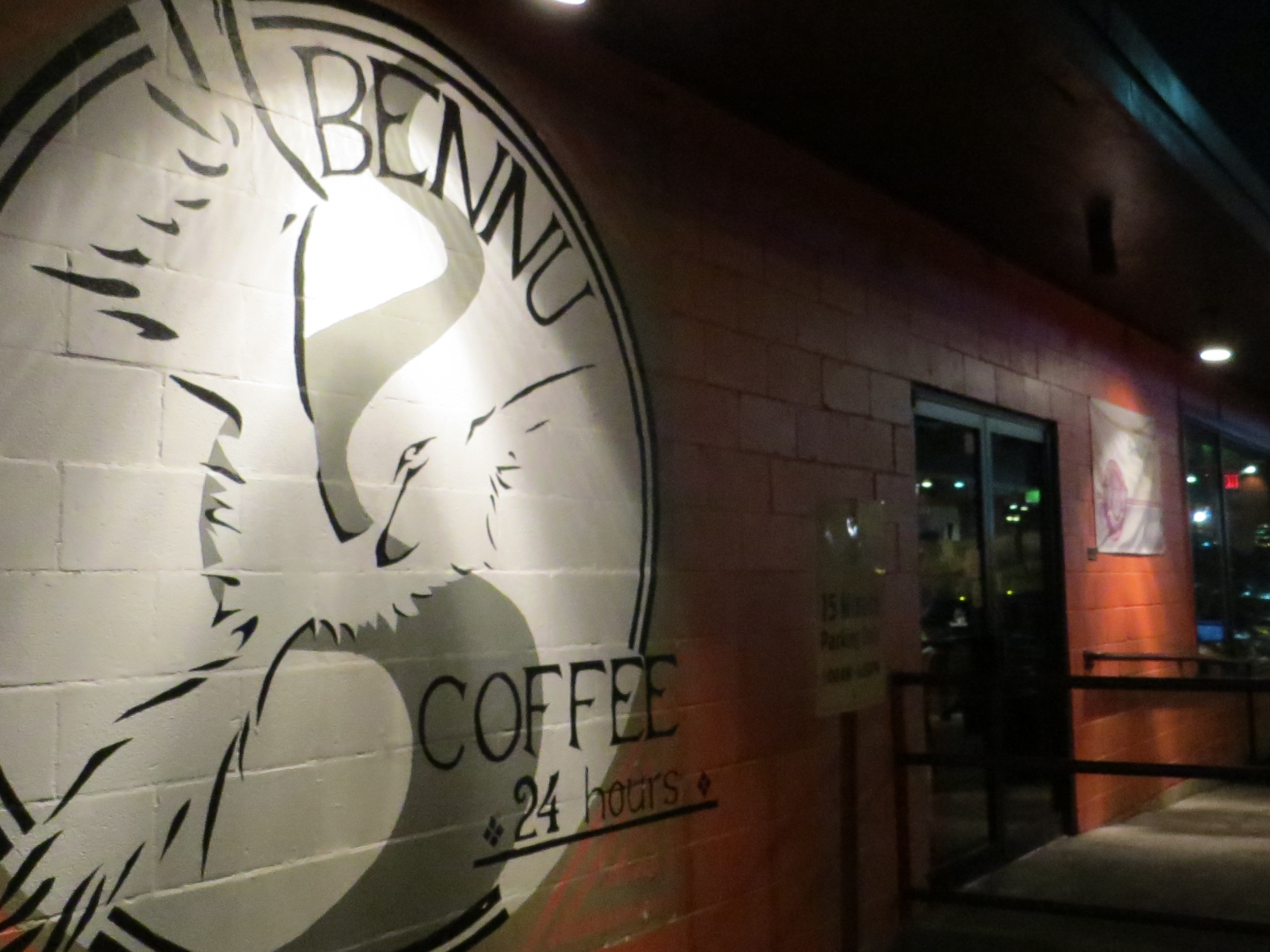
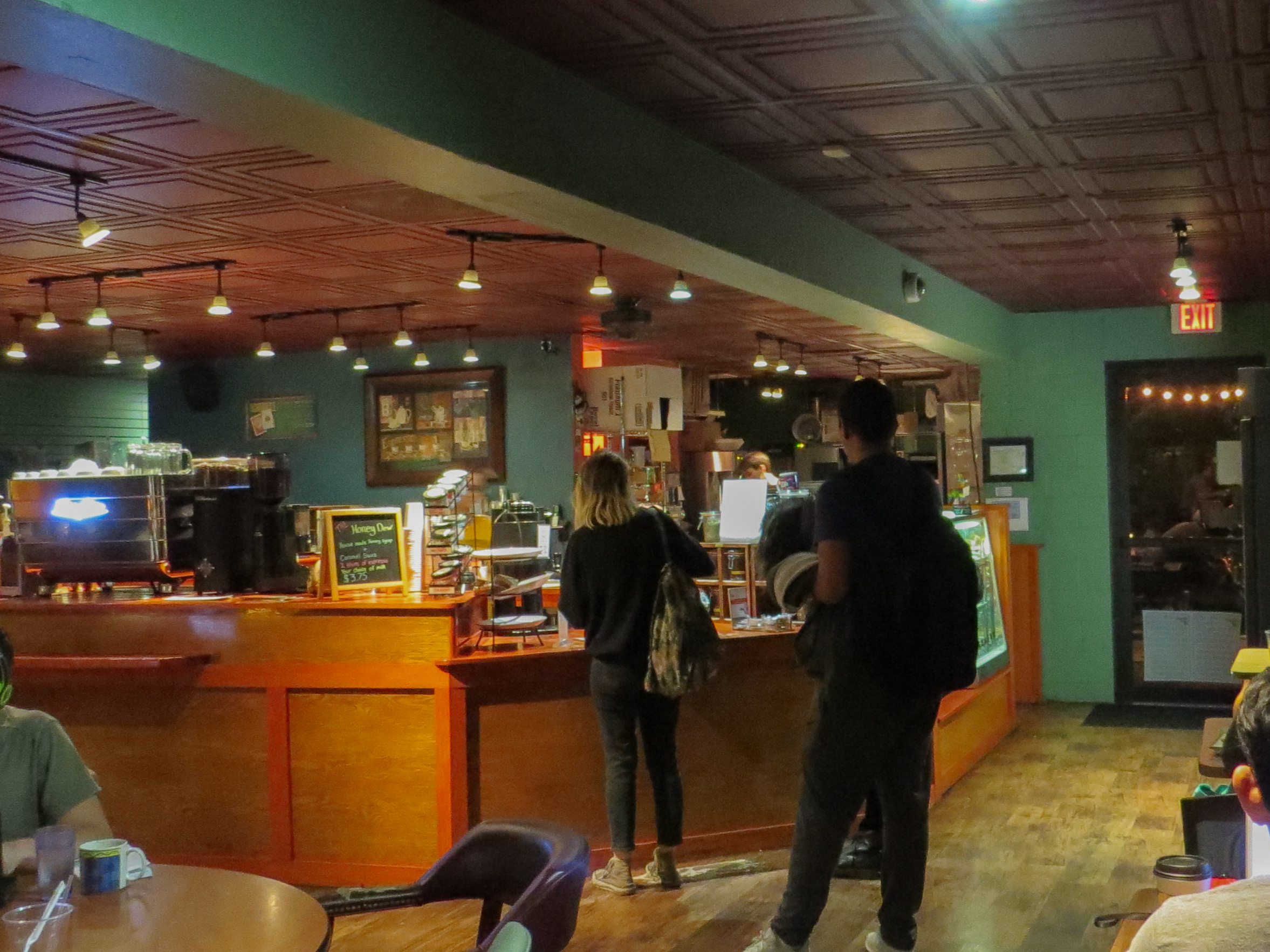
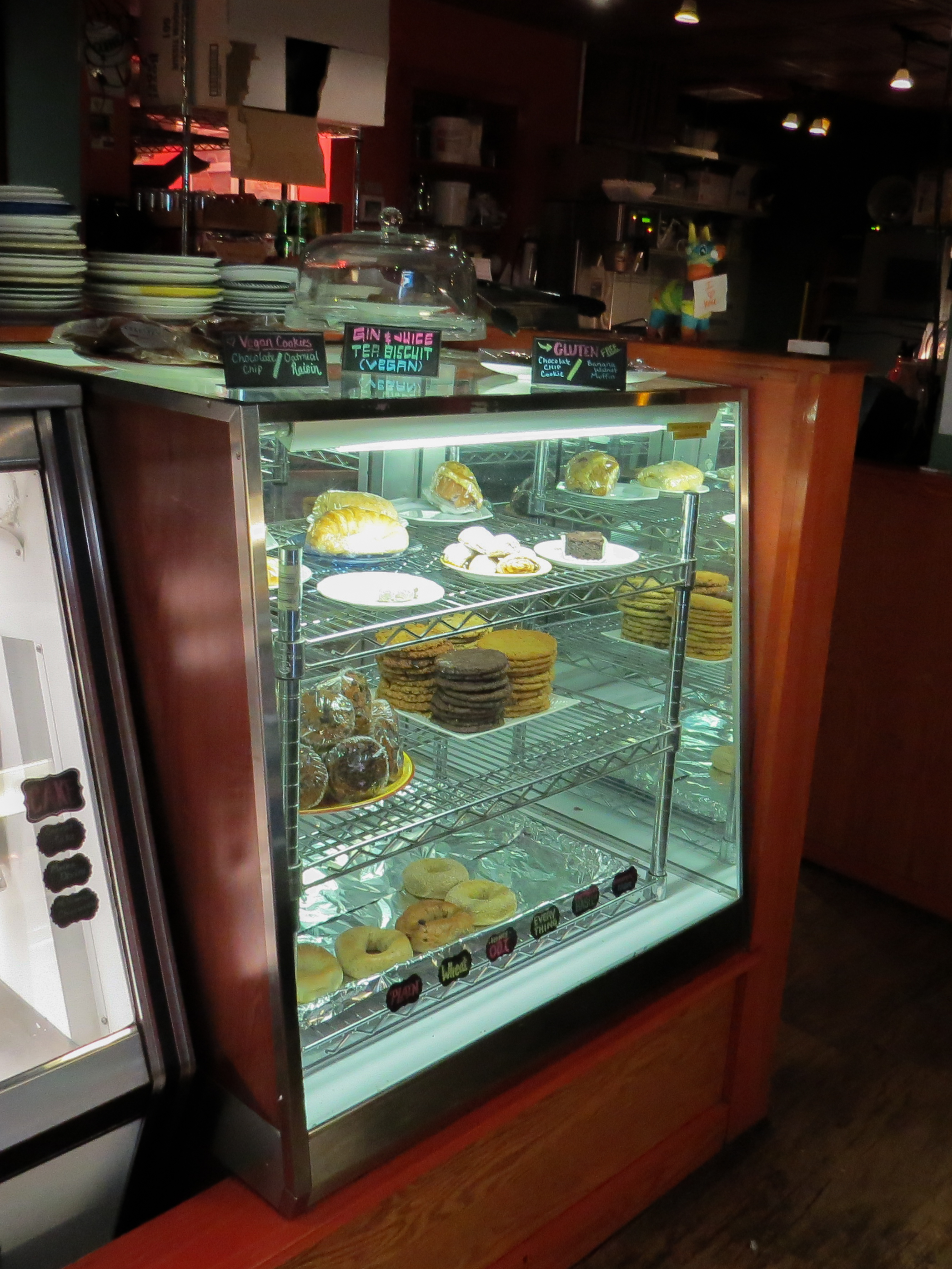
Usability Test Photos
Usability Test Video
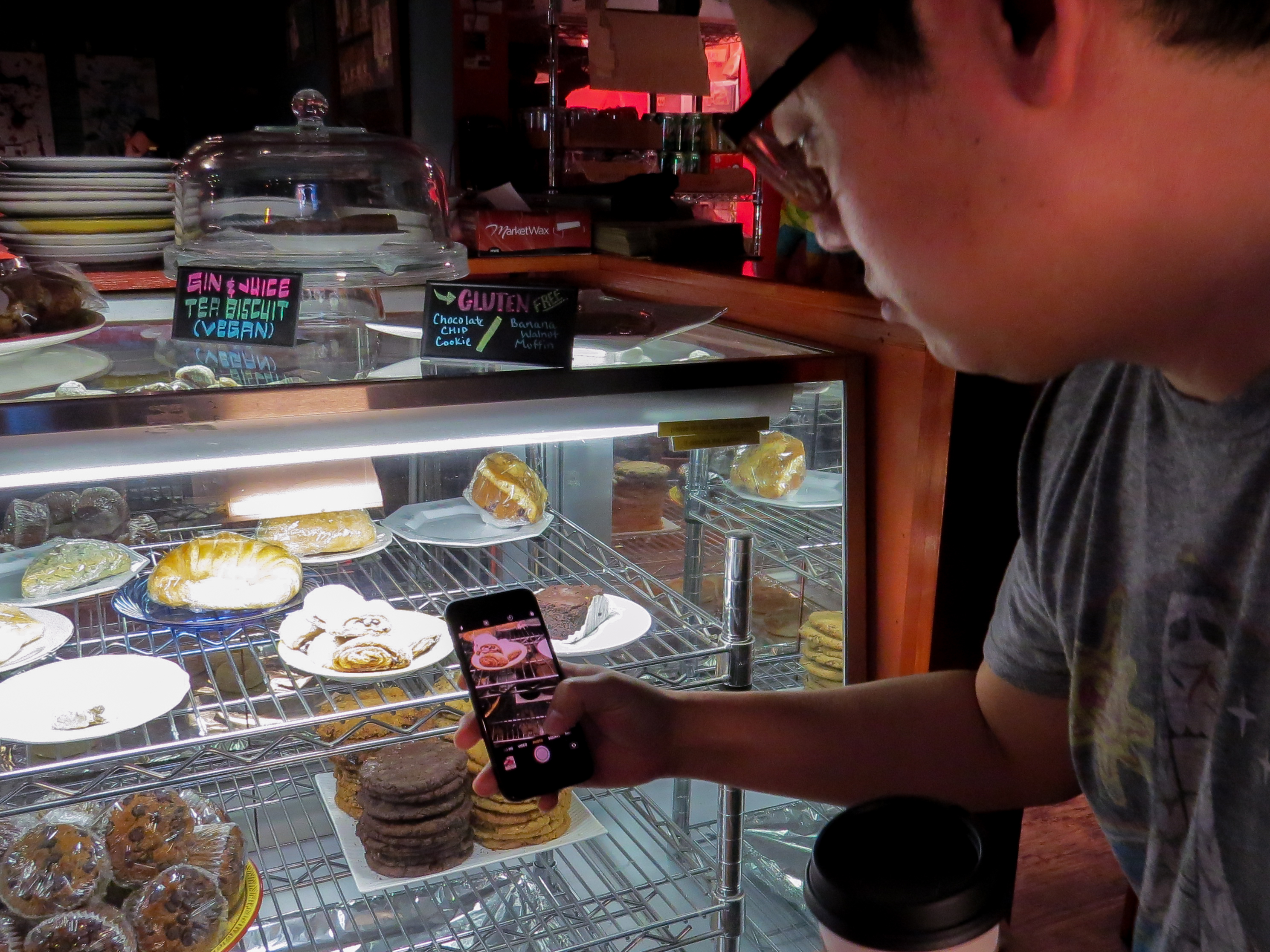
Prototype Usability Testing Video: Cafe Pro - Food Item Scan Feature
Usability Test Reflections
Prototype Evolution
This prototype evolved quite a bit, both forward and backward. I originally thought to develop a prototype for usability testing utilizing only transparency films. The films were going to serve as mock screens between the user and the food items they were viewing. I was planning to create screens that could be switched out as users interacted with the transparencies.
I then thought that it could be simple enough to create some sort of programming that would overlay text on the screen of a phone. It wasn't simple, but my instructor helped create the baseline code in xcode. The program creates a viewport for a live video feed on the top of the screen and a browser viewport on the bottom of the screen. By creating different html pages, as a user clicks on the "scan" button, the browser cycles through set html links.
In the test, the user is directed to scan certain food items and the html screens would provide information about those items, giving the illusion that the app is actually recognizing the items in the video viewport. I thought I was set and would just learn html at that point to create the html pages for each food item. HTML and CSS turned out to be much more challenging to utilize, so the resulting food information overlays are relatively simple. In all, I was happy with the outcome of the project and the evolution taught me to reach for a challenge, ask for help, and settle for simple all at the same time.
Prototype Feedback
Both users were able to scan for items. I think that there were three key points to improve upon. First, I needed to help each user find the scan button. That button can be made more clear. Second, one user in particular kept pressing the scan button which resulted in the wrong html page loading. Instead of pressing the button and getting information for "Chocolate cookie", she pressed it twice and it cycled past the cookie and onto the muffin html page.
One last thing I noticed in the user testing and which seems important for the app was that both users did not feel compelled to press the buy button. Once I asked them to make a purchase, it was clear what to press, but I had hoped they would curiously press the button.
Prototype Improvements
I would improve the prototype in multiple ways. First, both users who tested the app said that they would like calorie or macro-nutrient information, such as how many grams of carbohydrate or how much sodium is in the food item. Secondly, I would add related food items as one of the users suggested. For example, when scanning the rugelach, the app could allow the cafe owner to recommend earl grey tea to go with it.
I would also like to improve the prototype by making the scan button into an icon like the one in the wireframe mockup. I noticed both users looking for the button at times. Lastly, I noticed that users sometimes pressed the scan button rapidly and did not wait for the information to load. To make the prototype more successful, I would like to add a status indicator to provoke users to wait for the information to load.