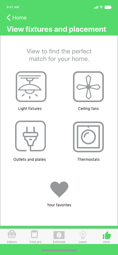

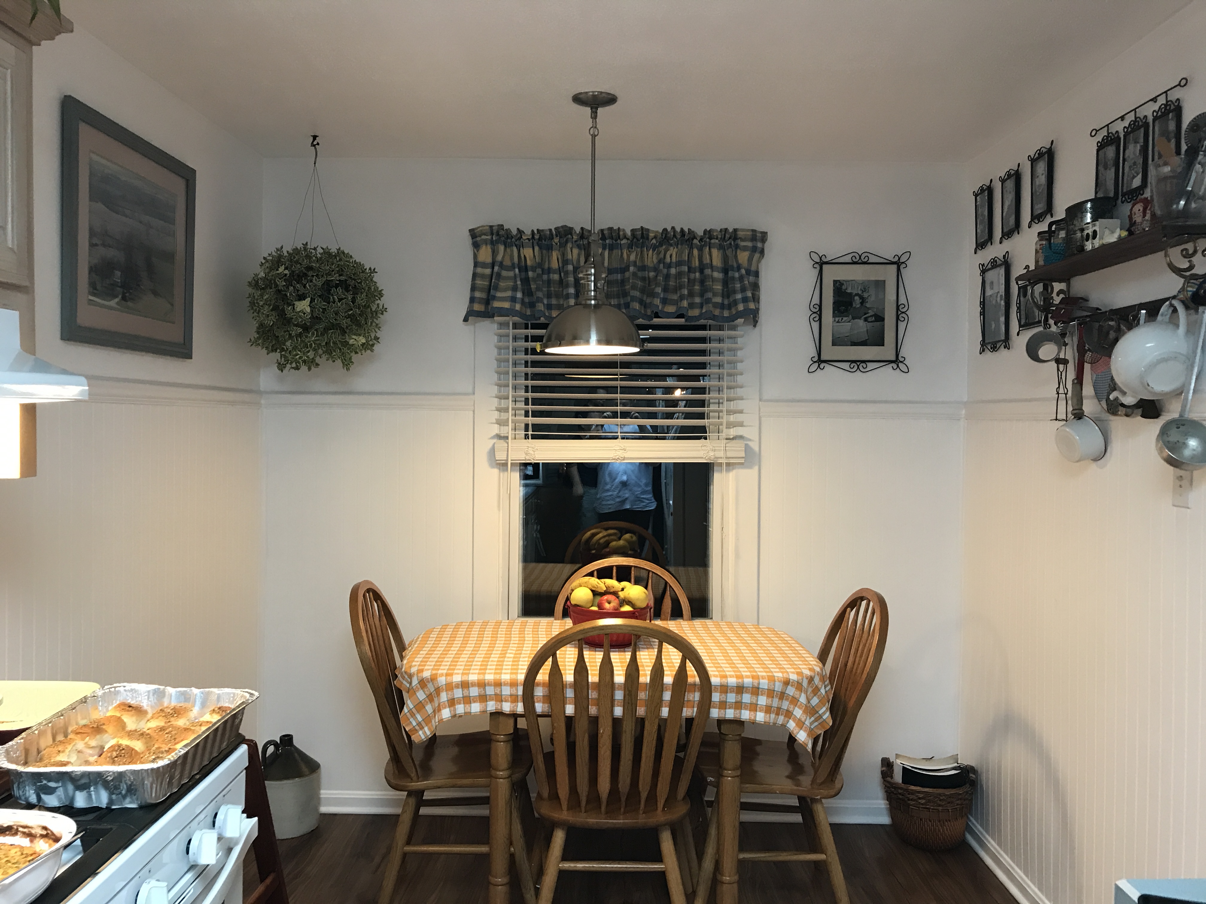
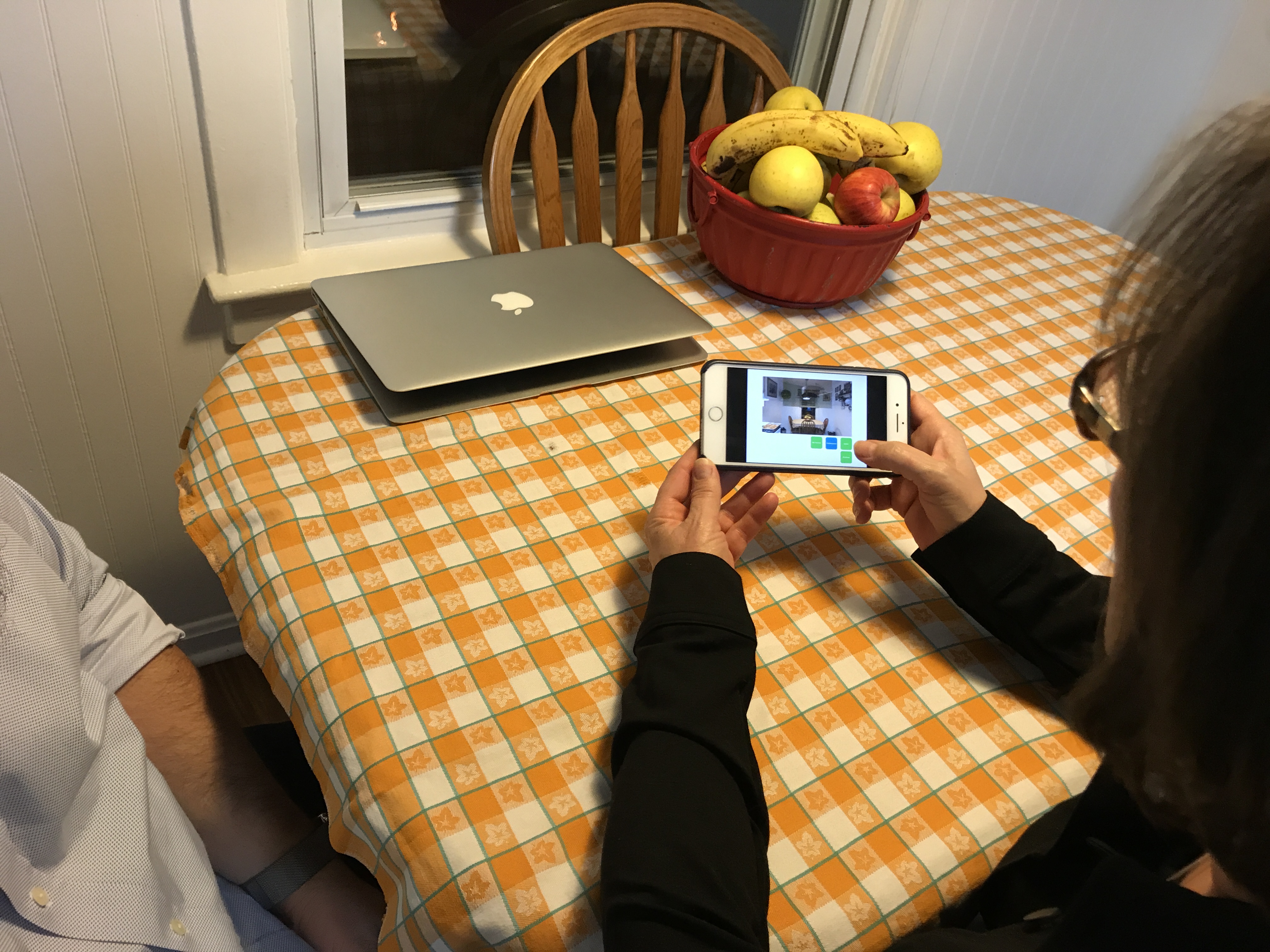
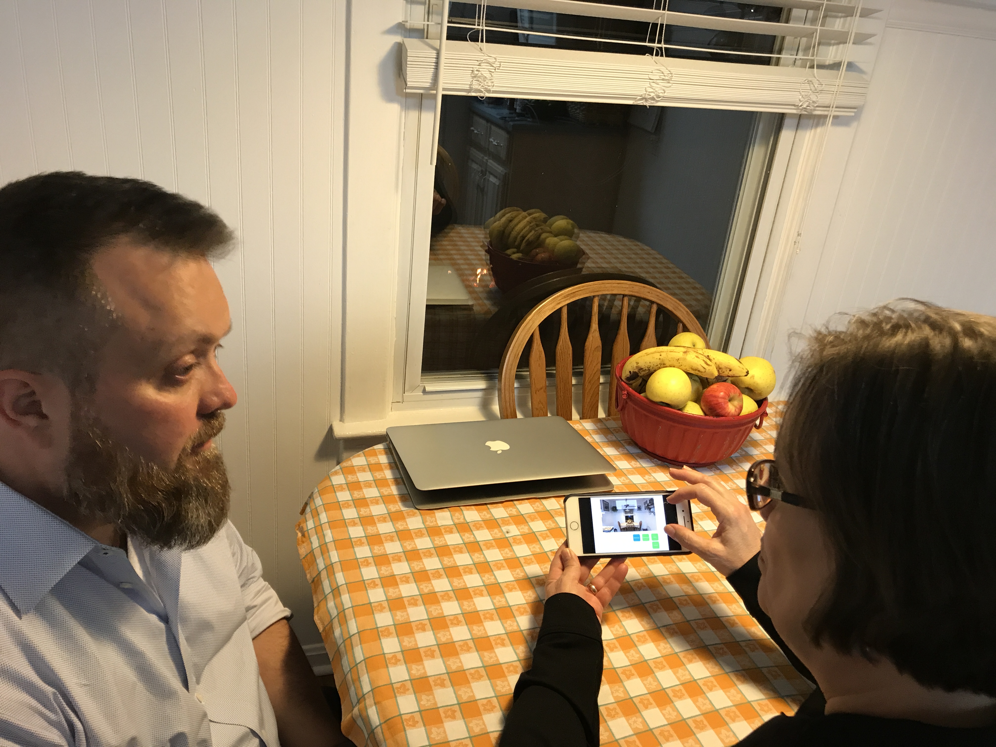
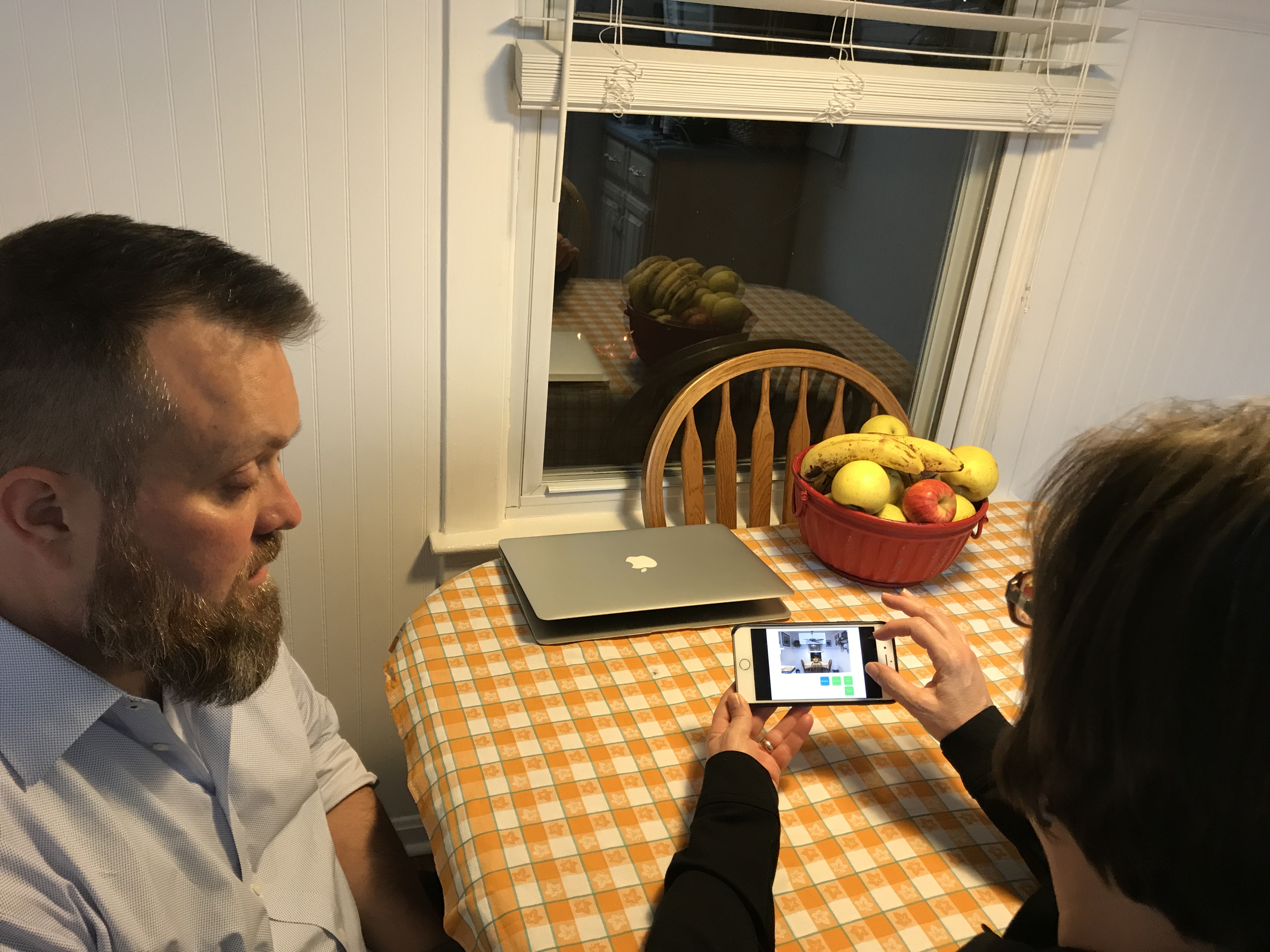
I started with Keynote to develop a simple structure where I could easily insert participant photos during an experiment. After a few home tests on a computer, I decided to optimize the experiment by using the Keynote app on my phone to simulate the use Handy Edison’s augmented reality feature on a handheld device.
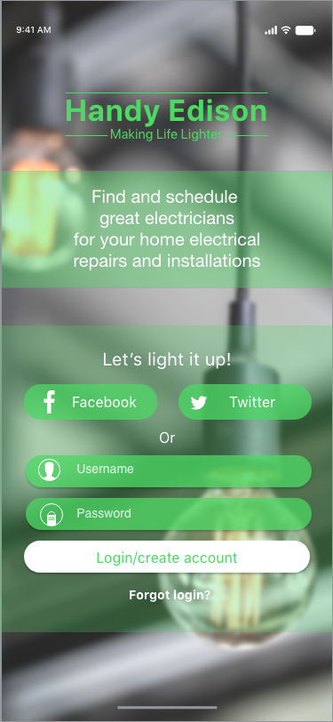
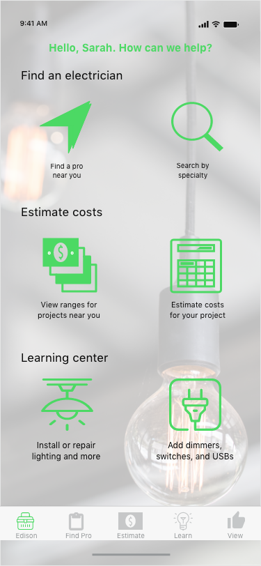
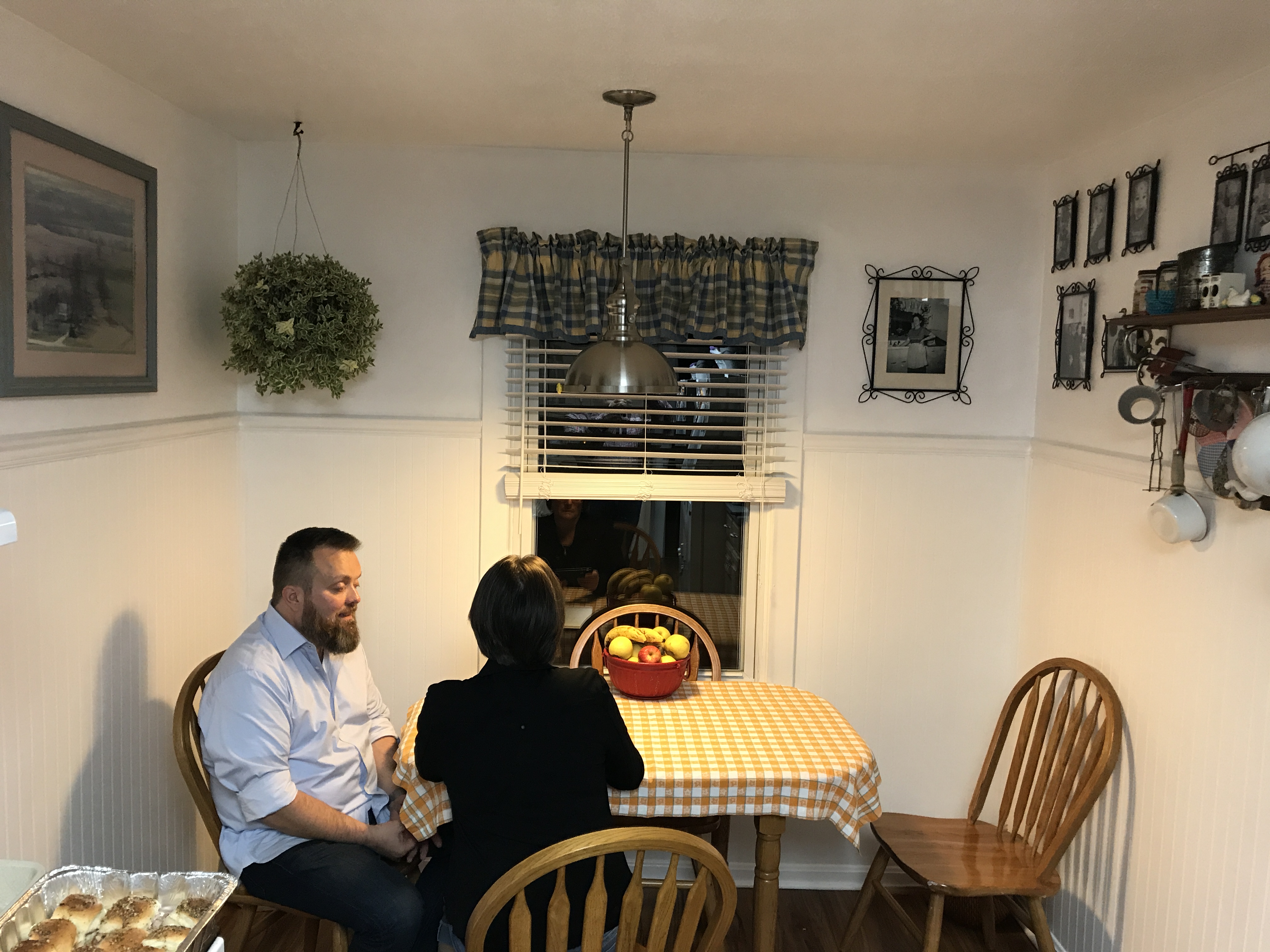
I tested Handy Edison design mockups created during assignment 3 (with some modifications based on feedback received as part of that submission) and the augmented reality prototype. My participants were: Polly Fenwick, a 46-year old nurse practitioner that uses technology devices (including a personal iPhone) every day however she would not describe herself as tech-savvy. Polly lives with her husband in rural Kentucky and she’s the mother of two adult children. The second participant was Ryan Kuo. Ryan is 39-years old and lives in Chicago with his wife and three children. Ryan heads a venture capital firm and consider himself an early tech adopter. He uses an iPhone and has several Apple products. The feedback that was unexpected primarily focused on the icons and naming conventions of app features. The participant’s descriptions of what they thought they might be able to do in a particular section of the app was wrong about 50% of the time. I discovered that the majority of the icons are not intuitive. Both participants struggled with understanding the augmented reality icon in the lower bar. This reinforced what others have said before and makes me realize that I need to move onto something else. Both participants found the augmented reality feature as something they would value in an app. However, they want it to include more features such as the price of the product, sort features, wider selection of fans, etc.
I plan to review the transcripts carefully to make a list of product features and app design opportunities based on the test results. I plan to revisit all of the icons from a design perspective and to consider how I can add depth of product information to the AR feature. I would like to explore how I might make a higher fidelity prototype than using Keynote so that I can somehow mask the necessary elements in the participant’s photo and showcase the ceiling fan better.